Have you heard of the Pareto principle? The idea that 80% of sales come from 20% of customers, or that the 20% of the richest people control 80% of the world’s wealth.
How about George K. Zipf? The author of the “Human behavior and the principle of least effort” and “The Psycho-Biology of Language” is best-known for “Zipf’s Law“, the observation that the frequency of a word is inversely proportional to the rank of its frequency. Over simplifying a little, the word “the” is about twice as frequent as the word “of”, and then comes “and”, and so on. This also applies to the populations of cities, corporation sizes, and many more natural occurrences.
I’ve spent time understanding and publishing work how Zipf’s work applies in search engines. And the punchline in search is that the Pareto principle and Zipf’s Law are hard at work: the first item in a list gets about twice as many clicks as the second, and so on. There are inverse power law distributions everywhere.
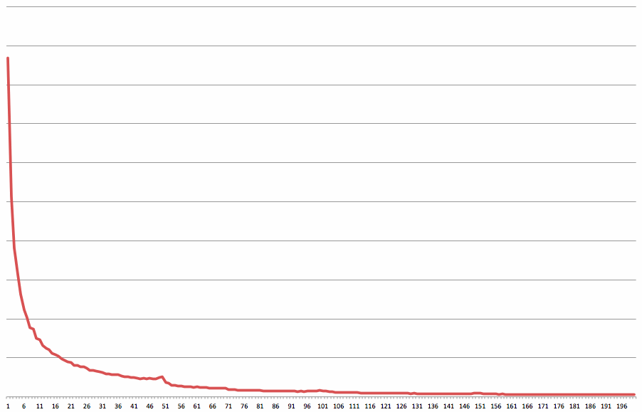
The eBay Search Results Click Curve
Here’s the eBay search results click curve, averaged over a very large number of queries. The y-axis is the total number of clicks on each result position, and the x-axis is the result position. For example, you can see that the first result in search (the top result, the first item you see when you run a query) gets about eight times as many clicks on average as the fifteenth result. The x-axis is labelled from 1 to 200, which is typically four pages of eBay results since we show 50 results per page by default.
As a search guy, I’m not surprised by this curve (more on that topic later). It’s a typical inverse power law distribution (a “Zipf’s Law” distribution). But there are a couple of interesting quirks.
Take a look at the little bump around result position 50 on the x-axis. Why’s that there? What’s happening is that after scrolling for a while through the results, many users scroll to the very bottom of the page. They then inspect the final few results on the page (results 46 to 50), just above the pagination control. Those final few results therefore get a few more clicks than the ones above that the user skipped. Again, this isn’t a surprise to me — you’ll often see little spikes after user scroll points (in web search, you’ll typically see a spike in result 6 or 7 on a 10-result page).
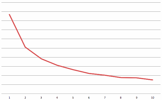
I’ve blown up the first ten positions a little more so that you can see the inverse power law distribution.

Search click curve for the first 10 results in eBay search.
You can see that result 1 gets about 4 times as many clicks as result 10. You can also see that result 2 gets about 5/9ths of the clicks as result 1. This is pretty typical — it’s what you’d expect to see when search is working properly.
Interestingly, even if you randomize the first few results, you’ll still see a click curve that has an inverse power law distribution. Result 1 will almost always get more clicks than result 2, regardless of whether it’s less relevant.
Click Curves Are Everywhere
Here are some other examples of inverse power law distributions that you’ll typically see in search:
- The query curve. The most popular query is much more popular than the second most popular query, and so on. The top 20% of queries account for at least 80% of the searches. That’s why caching works in search: most search engines serve more than 70% of their results from a cache
- The document access curve. Because the queries are skew in distribution, and so are the the clicks per result position, it’s probably not surprising that a few documents (or items or objects) are accessed much more frequently than others. As a rule of thumb, you’ll typically find that 80% of the document accesses go to 20% of the documents. Pareto at work.
- Clicks on related searches. Most search engines show related searches, and there’s a click curve on those that’s an inverse power law distribution
- Clicks on just about any list: left navigation, pagination controls, ads, and any other list will typically have an inverse power law distribution. That’s why there’s often such a huge price differential between what advertisers will pay in search for the top position versus the second position
- Words in queries, documents, and ads. Just like Zipf illustrated all those years ago, word frequencies follow an inverse power law distribution. Interestingly, and I explain this in this paper, Zipf’s formal distribution doesn’t hold very well on words drawn from web documents (a thing called Heap’s law does a better job). But the point remains: a few words account for much of the occurrences
What does this all mean? To a search guy, it means that when you see a curve that isn’t an inverse power law distribution, you should worry. There’s probably something wrong — an issue with search relevance, a user experience quirk (like the little bump I explained above), or something else. Expect to see curves that decay rapidly, and worry if you don’t.
See you again next Monday for a new post. If you’re enjoying the posts, please share with your friends by clicking on the little buttons below. Thanks!

If your business is to get eyeballs to display ads or to burn through an inventory of ads this makes perfect sense as target – all you want is to render more pages users will look at. But if what you’re trying to do is to increase your conversion rates (to sales) you might want to weight the series. The 20% of people that buy the most will likely produce less clicks than the 80%. I’d be very curious to see what that series look like if you replace your Y axis by (click_rate * conversion_rate^2) instead. I suspect that would look different, filter smart spam for free and give you a better target to train your algorithms.
Pingback: Clicks in Search « Another Word For It
Pingback: Measuring Search Relevance | Hugh E. Williams
Pingback: 3 – Google Filter Bubble Study | Traffic.Ventures Social
Pingback: Measuring the Filter Bubble: How Google is influencing what you click – Software Shop and Blog
Pingback: Measuring the Filter Bubble: How Google is influencing what you click – 4latestnews.com
Pingback: Measuring the Filter Bubble: How Google is influencing what you click – Planet Report
Pingback: Studie: Filterblase von Google | Ingolfs Blog
Pingback: Study Shows Google Manipulating Search Results, Despite Promises – Truth Megasite
Pingback: Google Search ‘Filter Bubbles’ Politically Divide Americans… – Google Site Search
Pingback: La búsqueda de Google "burbujas de filtro" divide políticamente a los estadounidenses, según un estudio – Informaciones Virales
Pingback: Measuring the "Filter Bubble": How Google is influencing what you click - SearchPal - Safe Search Engine
Pingback: Measuring the “Filter Bubble”: How Google is influencing what you click – MrPyro