I don’t like pie charts. Why? It’s almost impossible to compare the relative size of the slices. Worse still, it is actually impossible to compare the slices between two pie charts.
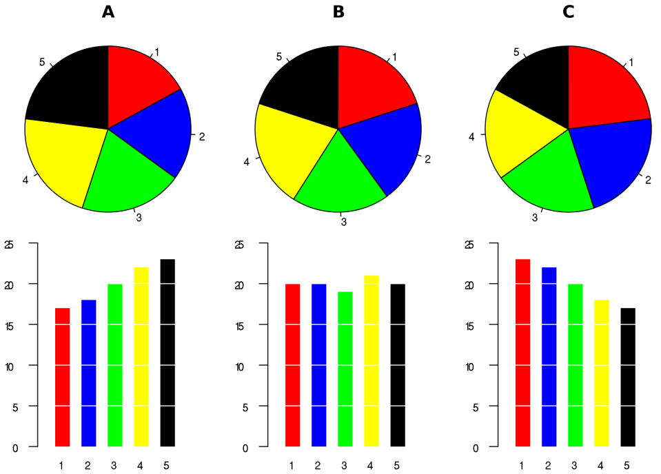
Pie charts in action.
Take the example above. Take a look at Pie Chart A. The blue slice looks the same size as the red or green slice. You might draw the conclusion they’re roughly the same. In fact, take a look at the histogram below — the red is 17 units, blue is 18 units, and green is 20 units. The histogram is informative, useful for comparison, and clear for communication. (There’s still a cardinal sin here though: no labels on the axes; I’ll rant about that some other day.)
Compare pie charts B and C above. It sure looks like there’s the same quantity of blue in B and C, and about the same amount of green. The quantities aren’t the same: the histograms below show that green is 19 and 20 respectively, and blue is 20 and 22.
You might argue that pie charts are useful for comparing relative quantities. I’d argue it’s possible but difficult to interpret. Take a look at three yellow slices in charts A, B, and C. They look to be similar percentages of the pies, but it’s hard to tell: they are oriented slightly differently, making the comparison unclear. What’s the alternative? Use a histogram with the y-axis representing the percentage.
Pie charts get even more ugly when there’s lots of slices, or some of the slices are ridiculously small. If you’re going to use them — I still don’t think it’s a good idea — then use them when there are only a few values and the smallest slices can be labeled. The pie chart below is ridiculous.
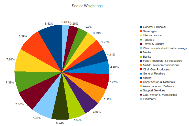
A pie chart that’s nearly impossible to read. I’m not sure what conclusions you could draw from this one.
Why do I care? I’m in the business of communicating information, and I spend much of my time reviewing information that people share with me. Clarity is important — decisions are made on data. See you next time.
